Aspiring Digital Product Designer
I’m a passionate and driven third-year Media Production student, currently developing my skills in UX/UI, graphic design and branding. I enjoy the challenges that come with learning and growing in these fields, constantly seeking opportunities to refine my abilities across digital design software. I enjoy the creative freedom in graphic design and UX/UI and I'm motivated by the variety that these industries offer. I take a hands on approach and I’m always eager to explore new tools, techniques, and approaches to enhance my design expertise.
This project is a concept for an urban streetwear e-commerce website featuring brands like Represent, Stüssy, Carhartt, and Polar Skate. I wanted to create something that not only looks realistic and visually aesthetic, but also delivers a slick experience for users who care about streetwear and style. The prototype includes a range of key pages - a landing page, product page, and individual product detail pages. Each one contains interactive features such as like buttons, add-to-bag functionality, size selection, and scroll elements. I also designed text animation, filtering categories and hover interactions to bring the user experience to life and display the extensive levels of detail put into this project. The content such as the large image and 'X' on the landing page is also completely original - I created these visuals myself and edited them using Adobe Suites to add a personal touch. While it’s not fully coded or built for mobile, the focus was on creating a high-quality, visually-led desktop experience that looks and feels realistic from a user perspective.
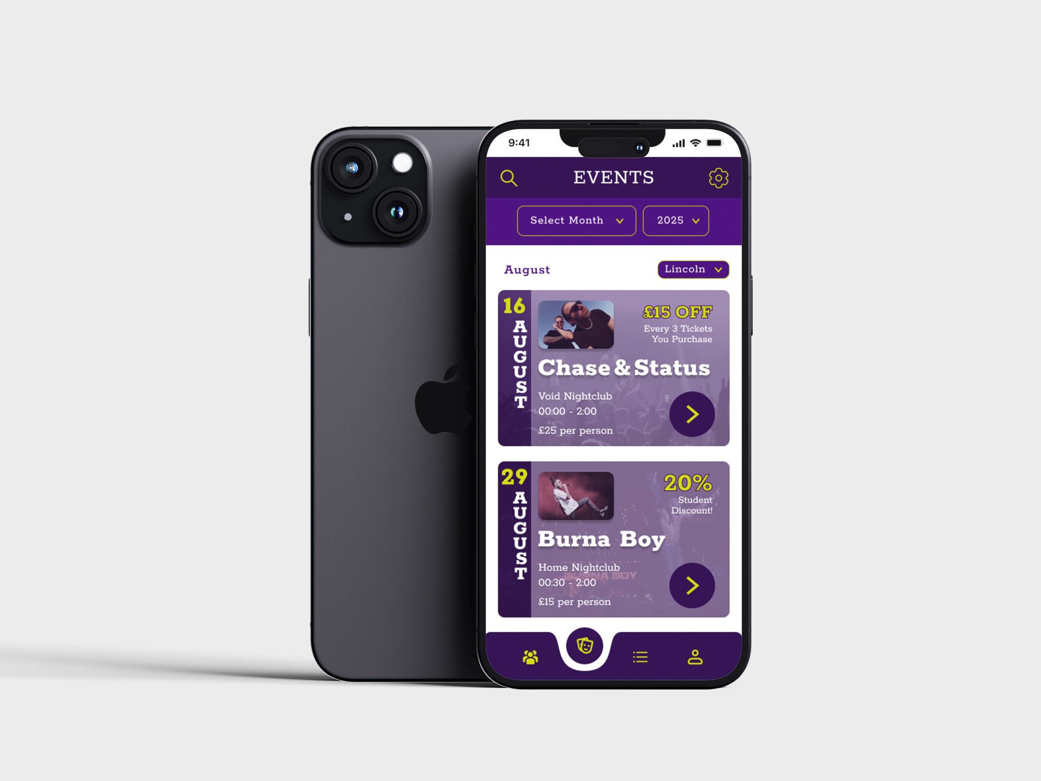
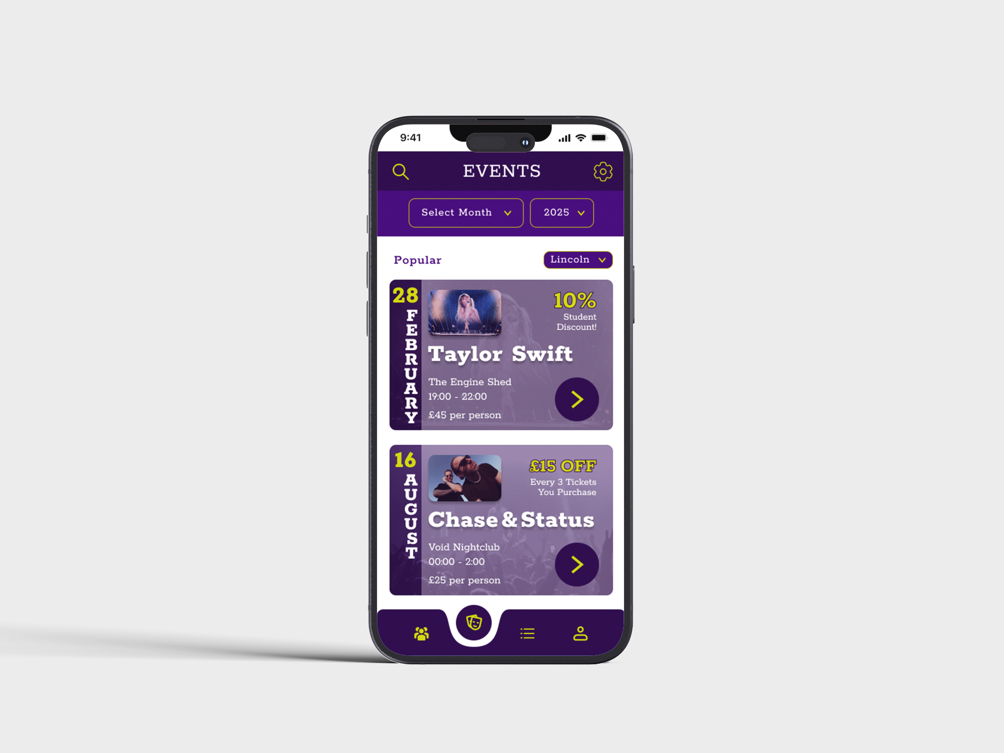
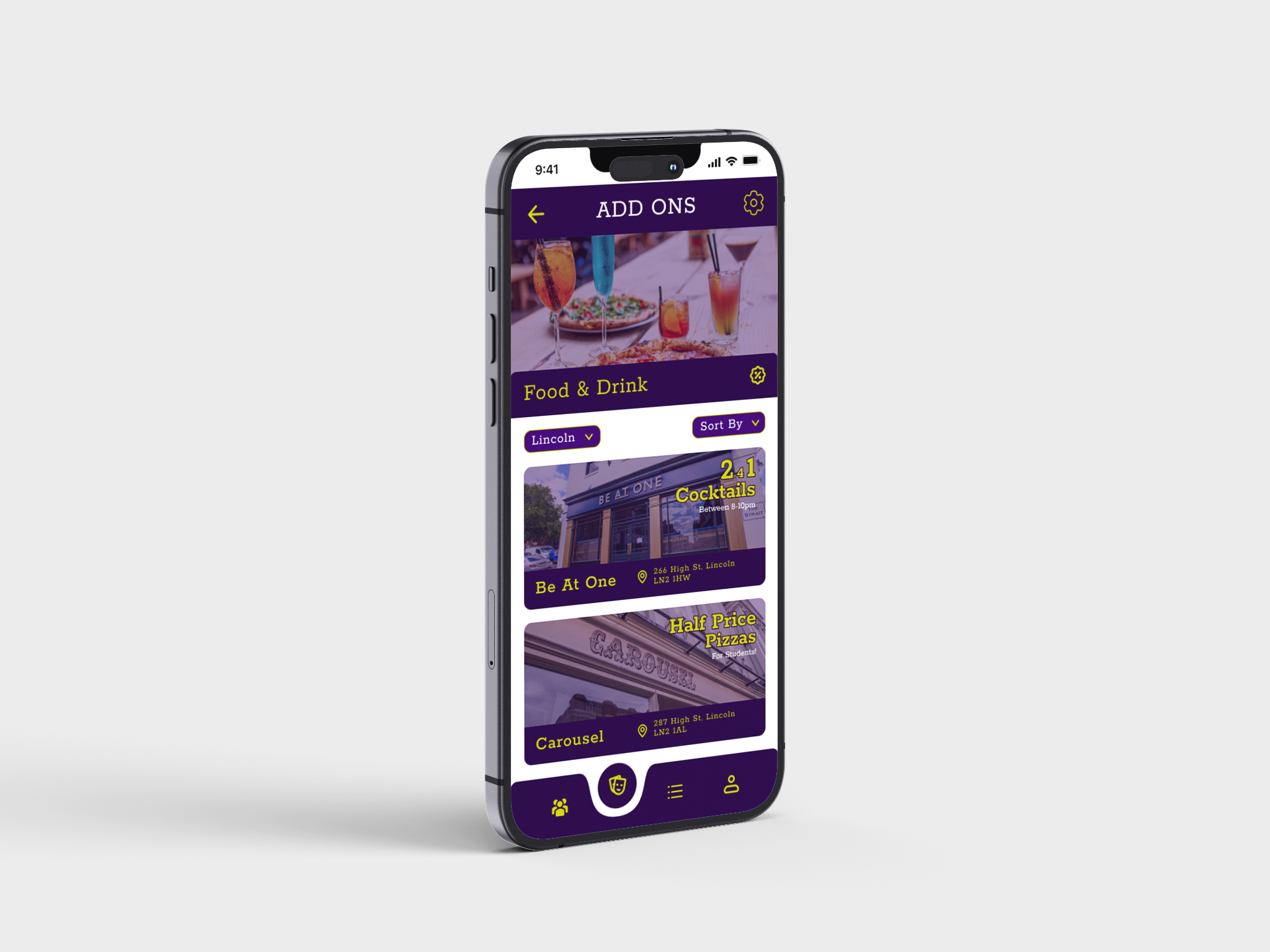
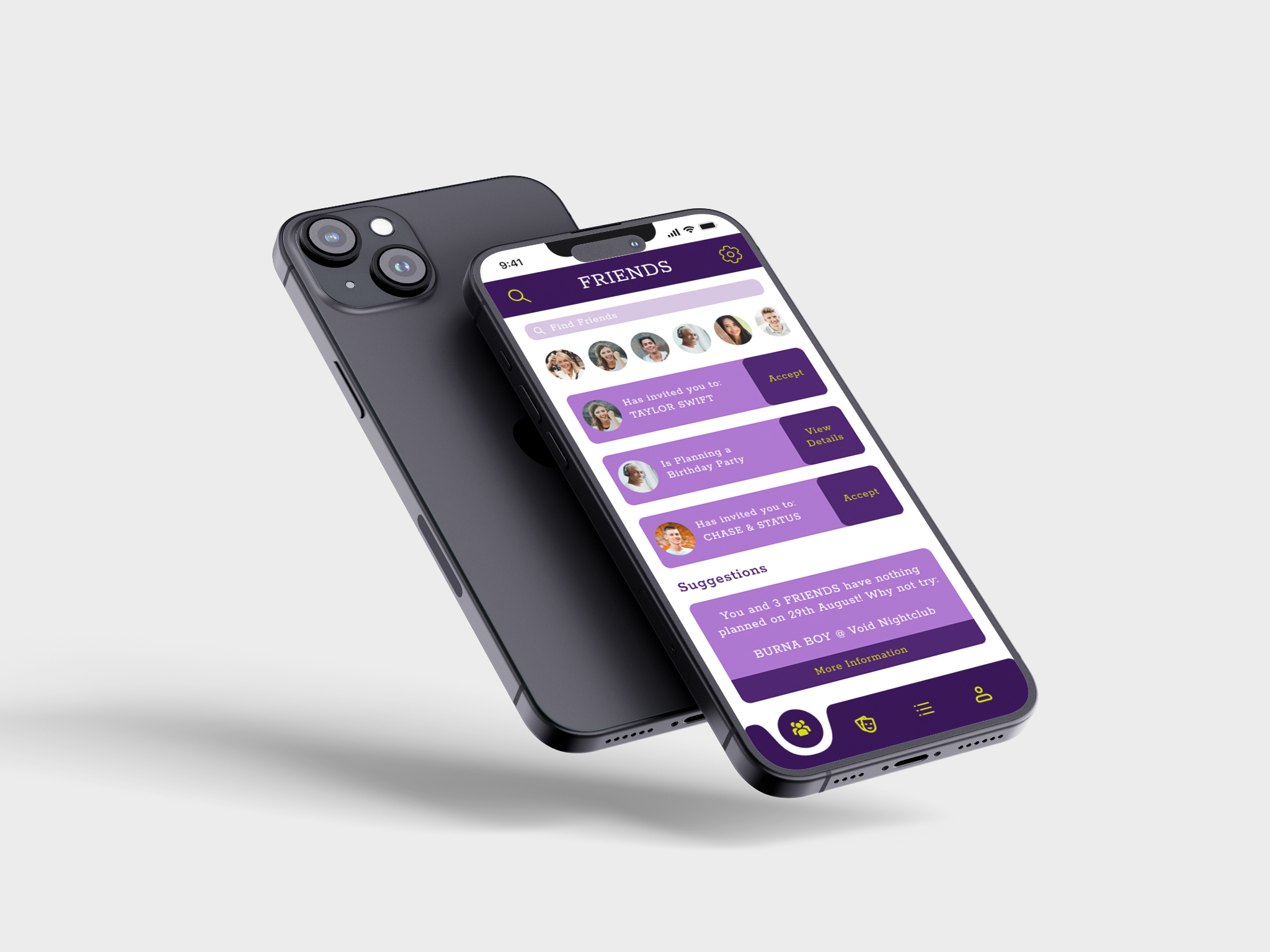
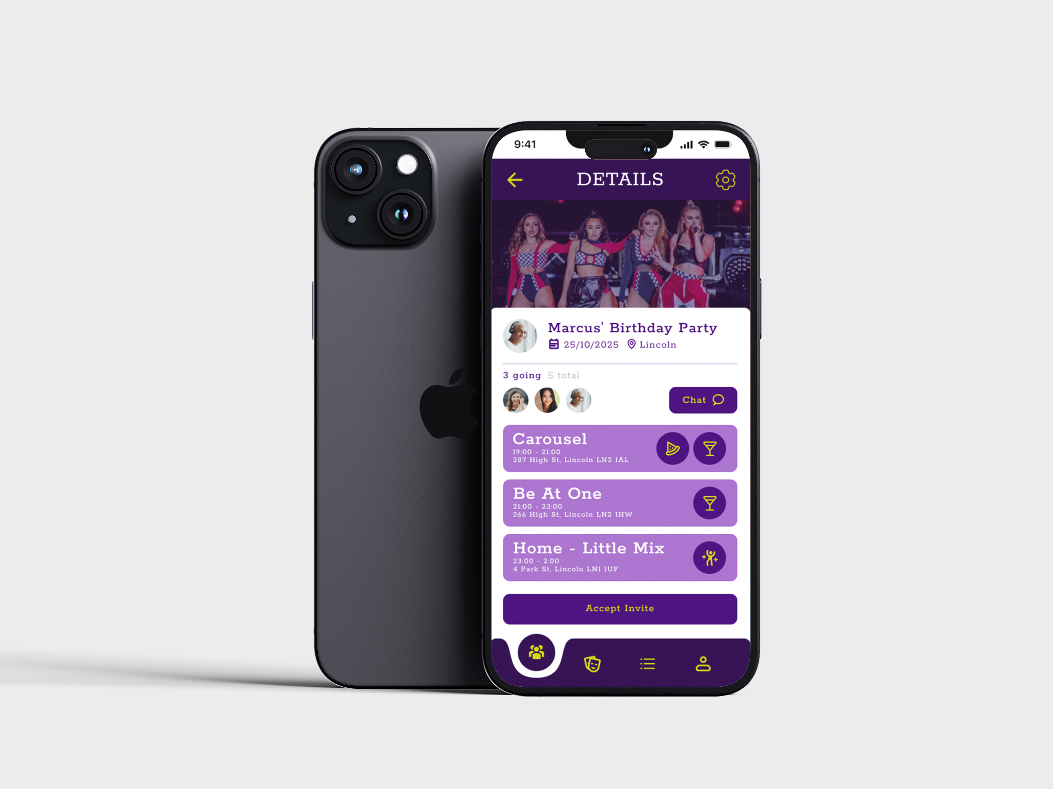
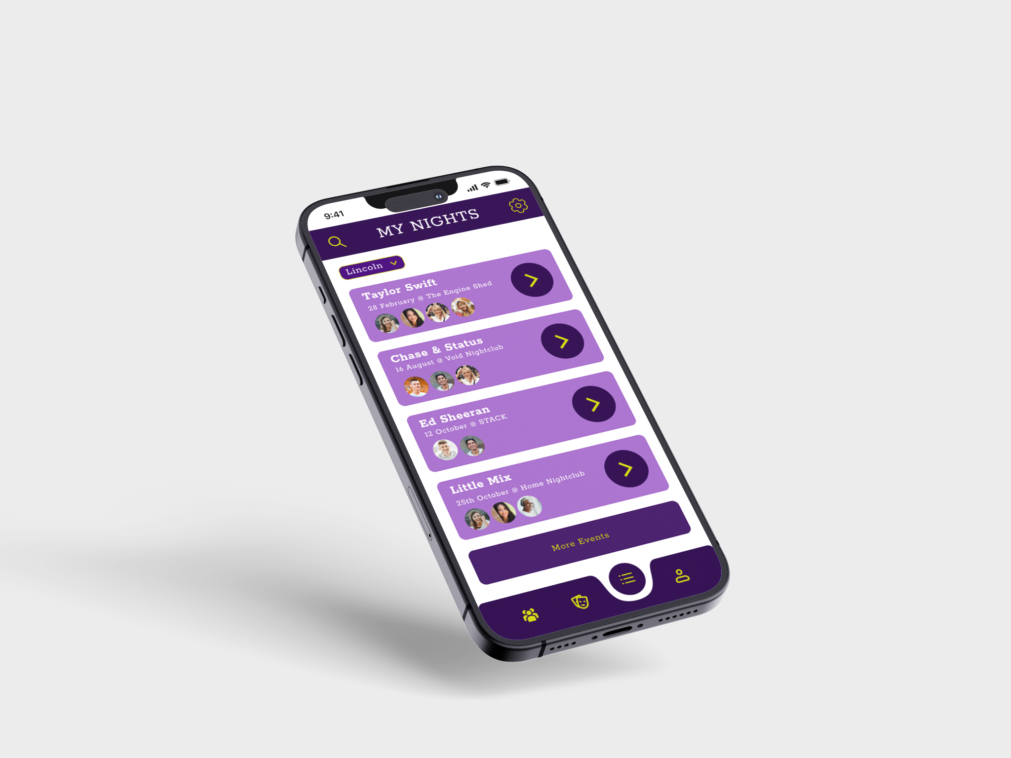
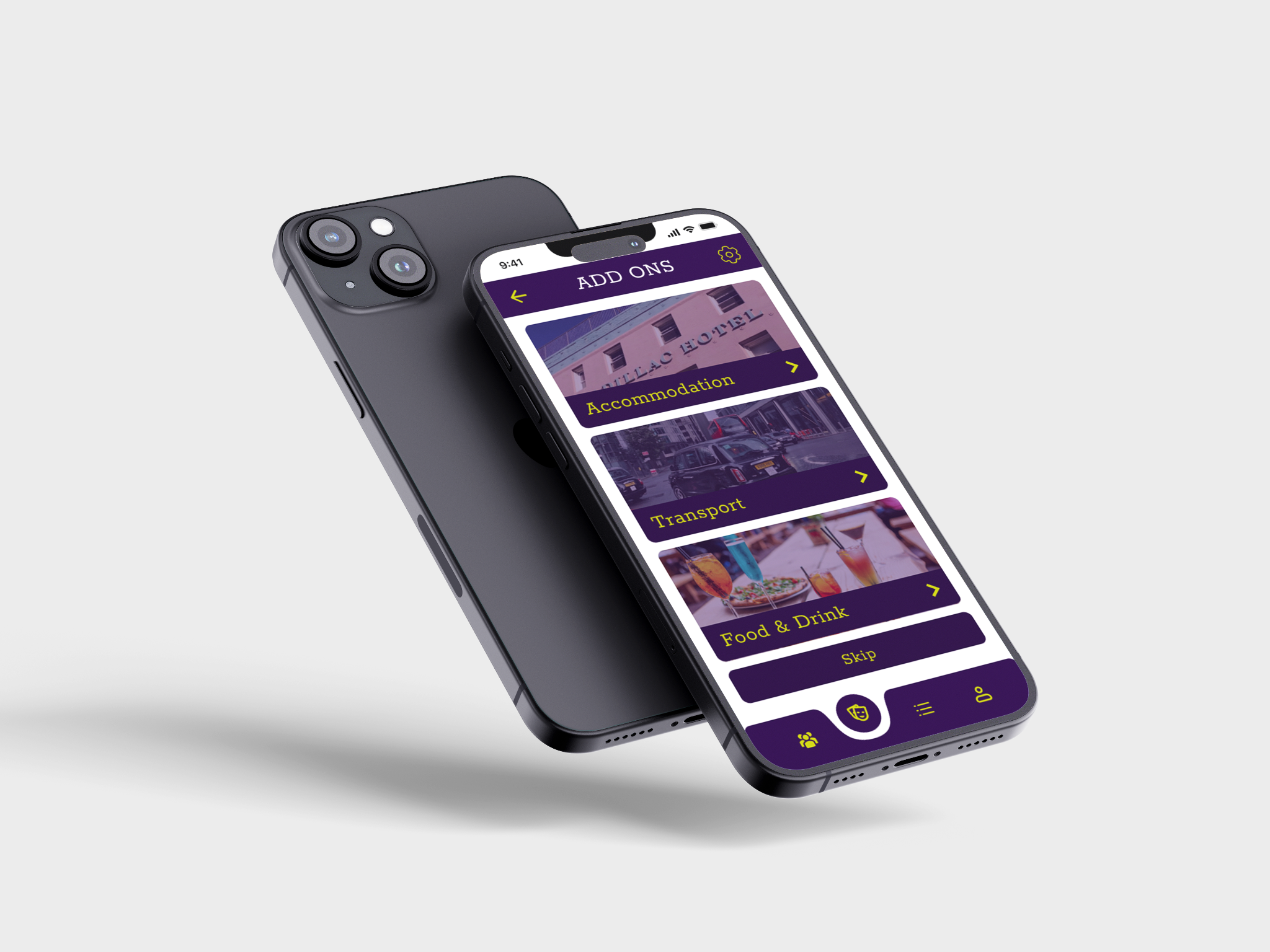
After discovering a strong passion for UX/UI design, I chose to dedicate my next university project to further exploring this field. For this self-initiated brief, I set myself the challenge of designing a prototype for a companion app to 'UniDays' , aimed at enhancing the student social experience.
The concept was centred around simplifying and enriching the process of planning nights out. The app featured a user-friendly journey where students could browse and select events, customise their plans with add-ons like food and accommodation, and easily share them with friends. One of the standout features was a collaboration page, allowing users to invite friends, chat, and coordinate plans all in one place.
To keep everything organized, I included a personalized dashboard that displayed all of the user’s upcoming bookings. Staying true to the student-focused nature of the app, I also integrated exclusive discounts on events, food, and drinks — making it both fun and budget-friendly.
Below are still images showcasing key pages from the prototype:

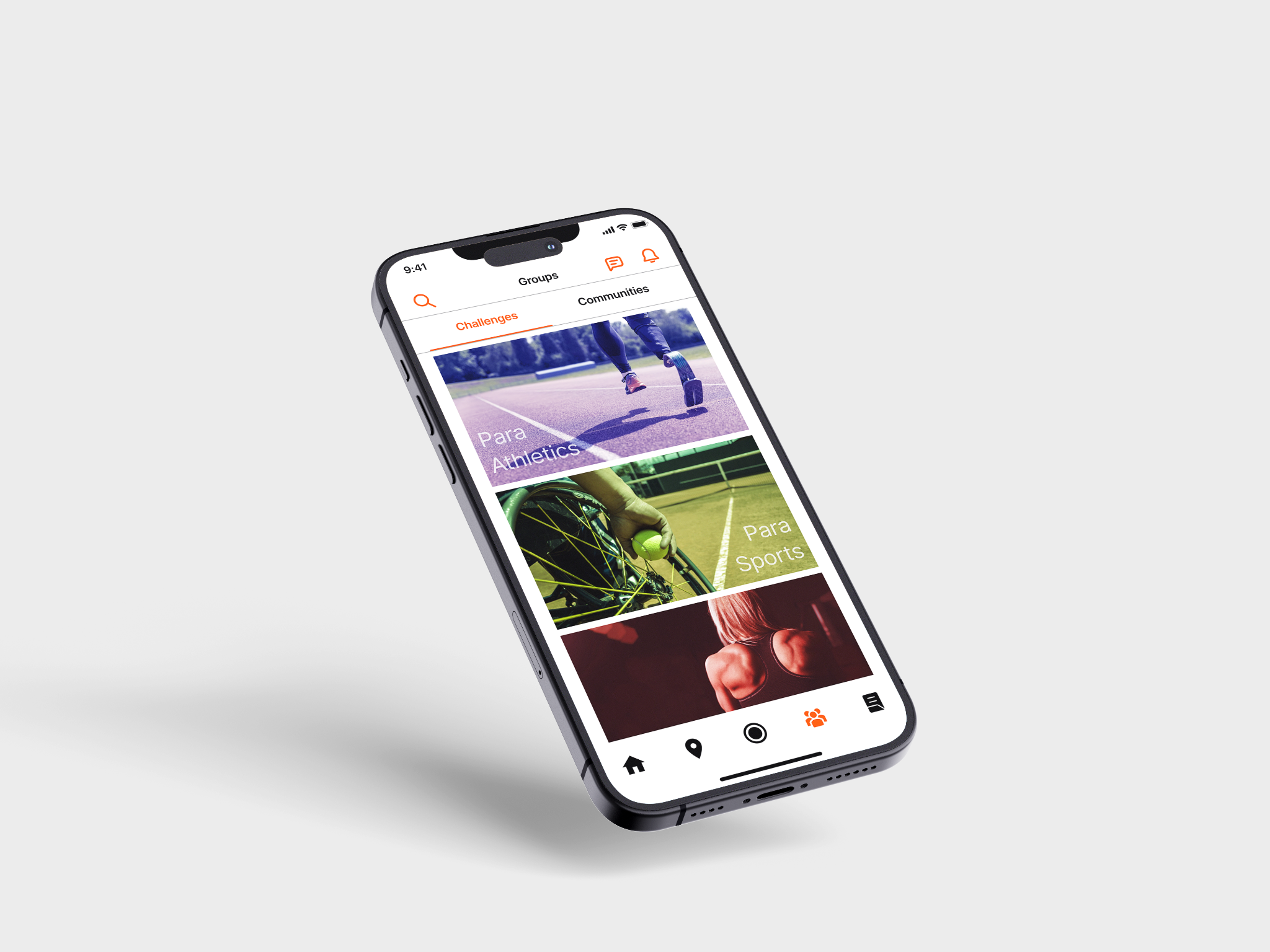
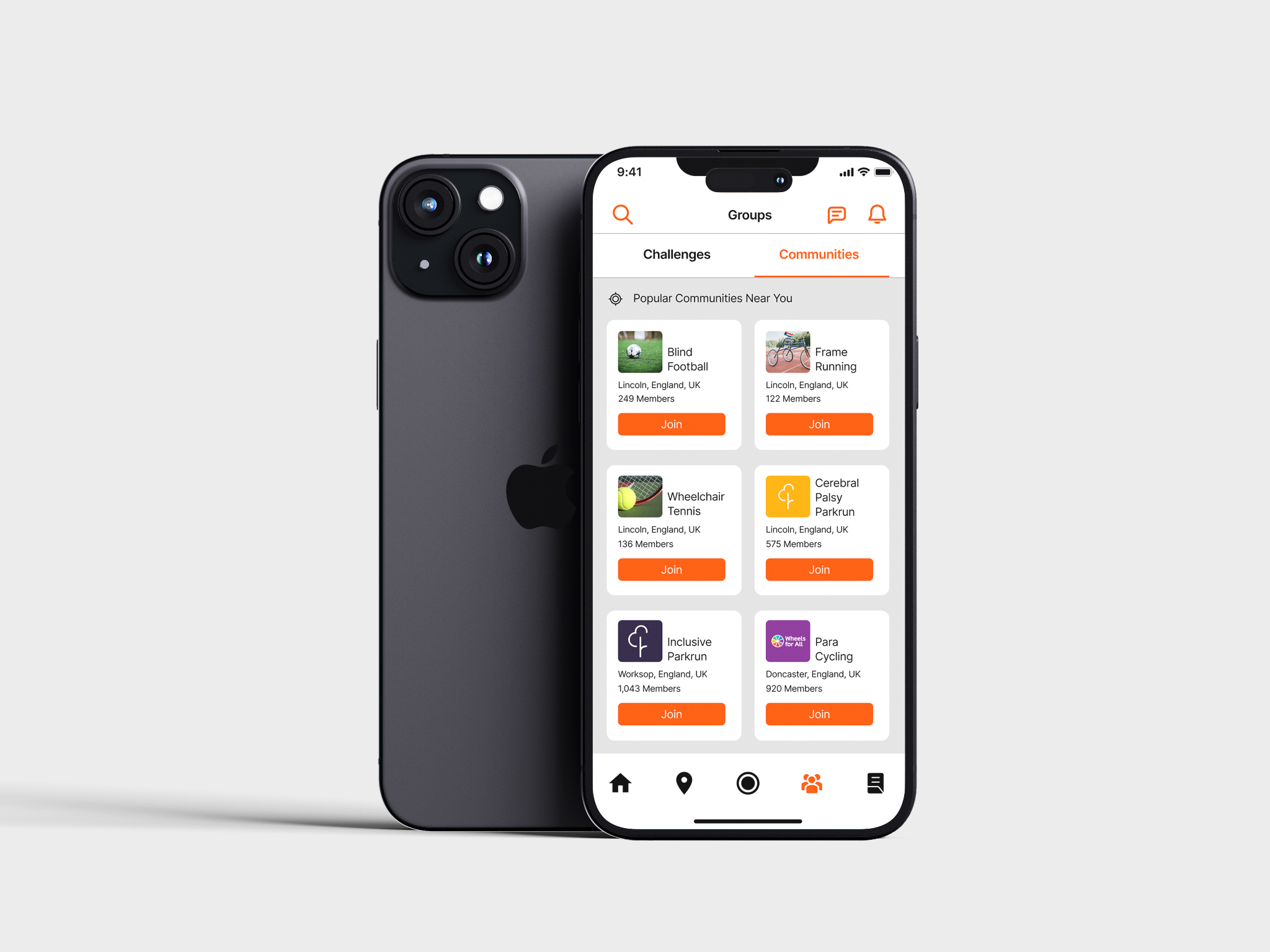
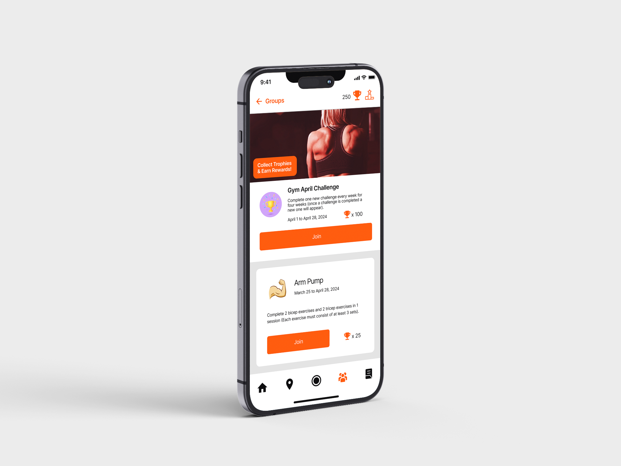
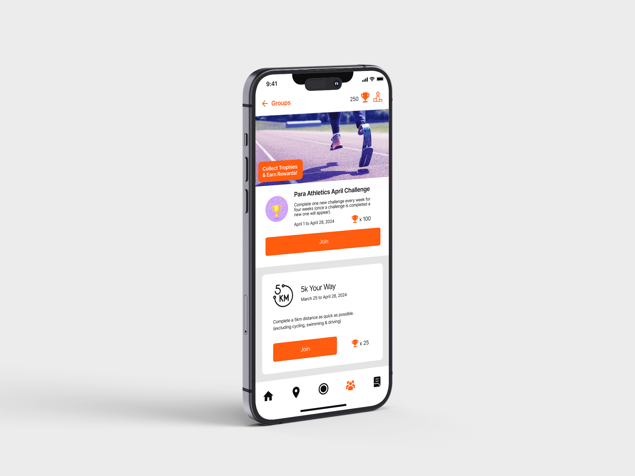
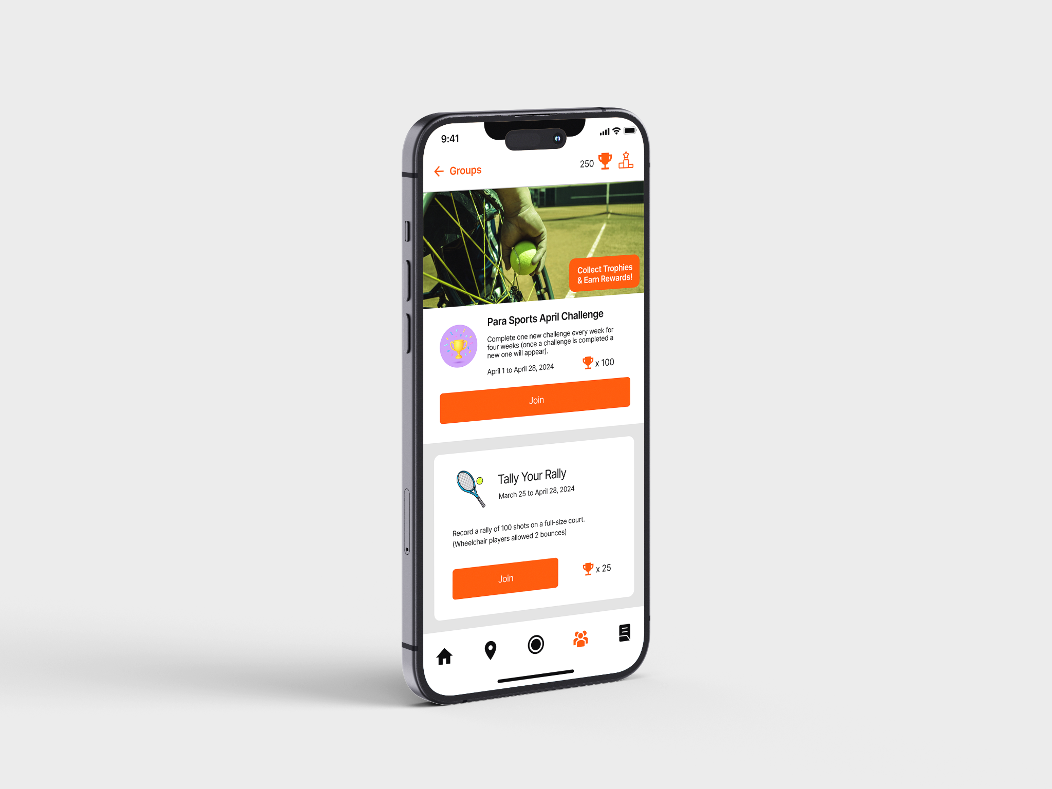
This project was my first hands-on experience with UX/UI design, and also my introduction to using Figma as a creative tool. The brief focused on reimagining the Strava app interface with a goal of enhancing inclusivity, accessibility, and diversity. I chose to centre my redesign around improving the experience for users with disabilities — a group that is often overlooked in fitness app design.
My concept introduced new challenge and community features specifically tailored to create a more welcoming and supportive environment. These features included adaptive challenges designed for a wide range of physical and cognitive abilities, allowing users to engage in fitness activities that suit their needs. I also designed community spaces based on both specific disabilities and adaptive sports, helping foster a stronger sense of camaraderie, representation, and belonging.
The project pushed me to think critically about user needs and accessibility standards, from inclusive language and intuitive navigation to visual clarity and color contrast. It was a valuable learning experience that taught me how design can play a meaningful role in making digital spaces more equitable and empowering for everyone.
Below are a few stills showcasing key elements of my redesigned interface:
For this project, my goal was to create a near-future sci-fi movie sequence that explores the effects of global warming and climate change through immersive audio. Using Adobe Audition, I assembled an audio sequence from various imported clips, layering in sound effects to create a crackling, futuristic atmosphere. I also applied a telephone receiver filter to news audio, simulating a radio intercom transmission. To complement the composition, I developed original animated visuals in Adobe After Effects, creating a visual narrative experience that blends sound and motion.
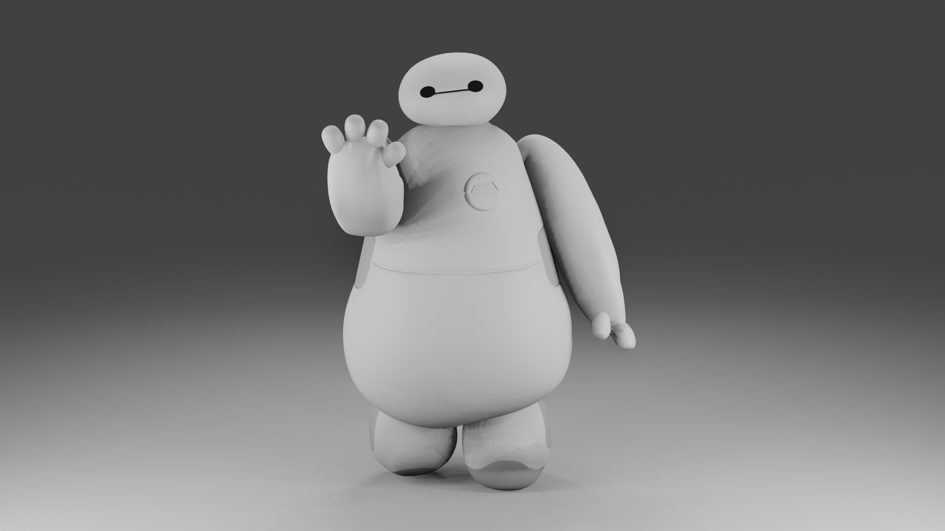
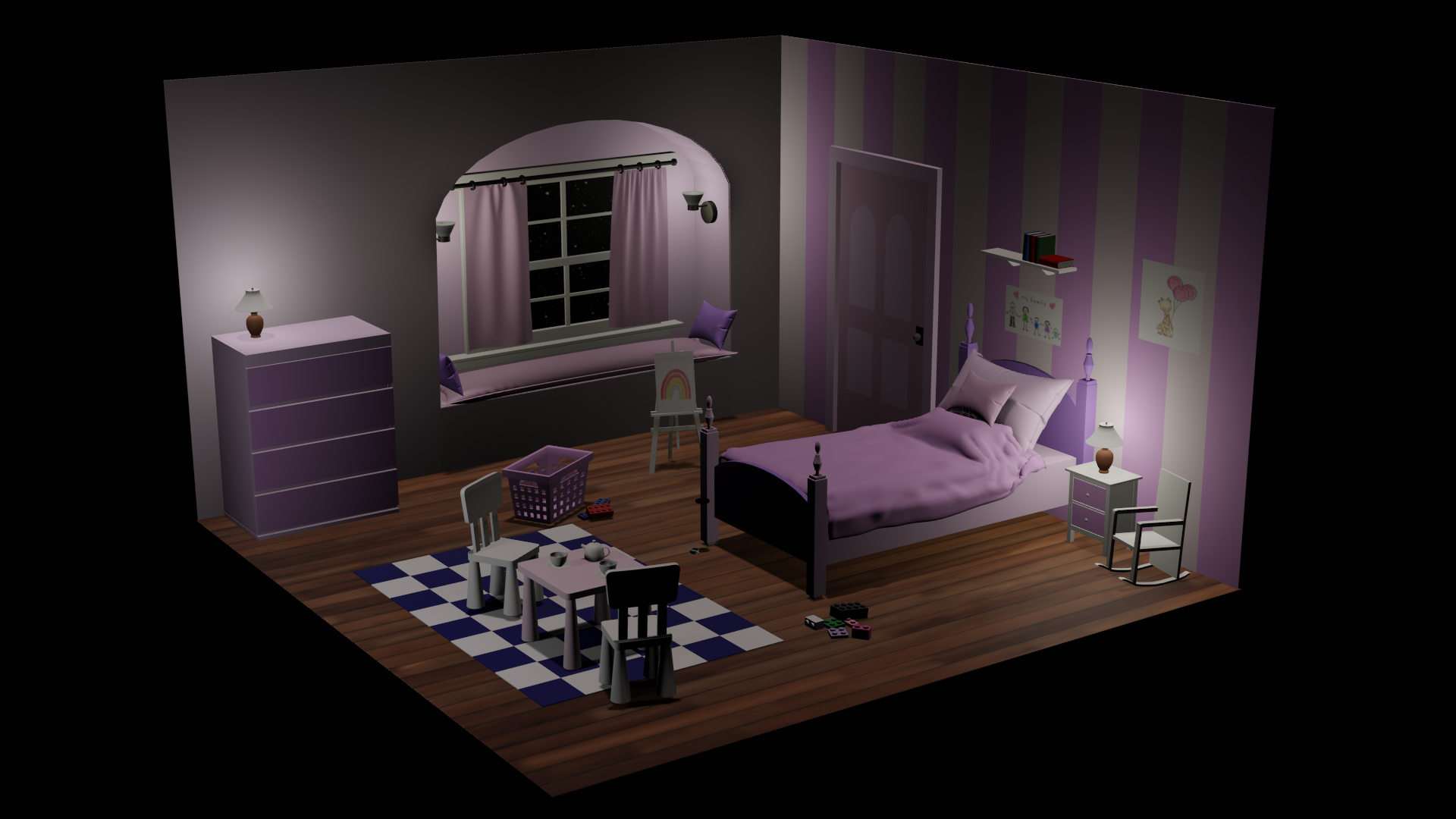
These three projects involved modelling a variety of items and characters inspired by some of my favourite sports and movies. Each one presented its own unique set of challenges, pushing me to think creatively and find solutions to unexpected problems during the design and animation process. Through these projects, I not only improved my 3D modelling skills but also expanded my technical abilities by learning how to use a range of new tools and techniques. One of the most valuable skills I picked up was animating objects along a path, which added a dynamic, professional touch to the final results.
Big Hero 6 - 'Baymax' Character Modelling
Monsters Inc - Boo's Bedroom Model
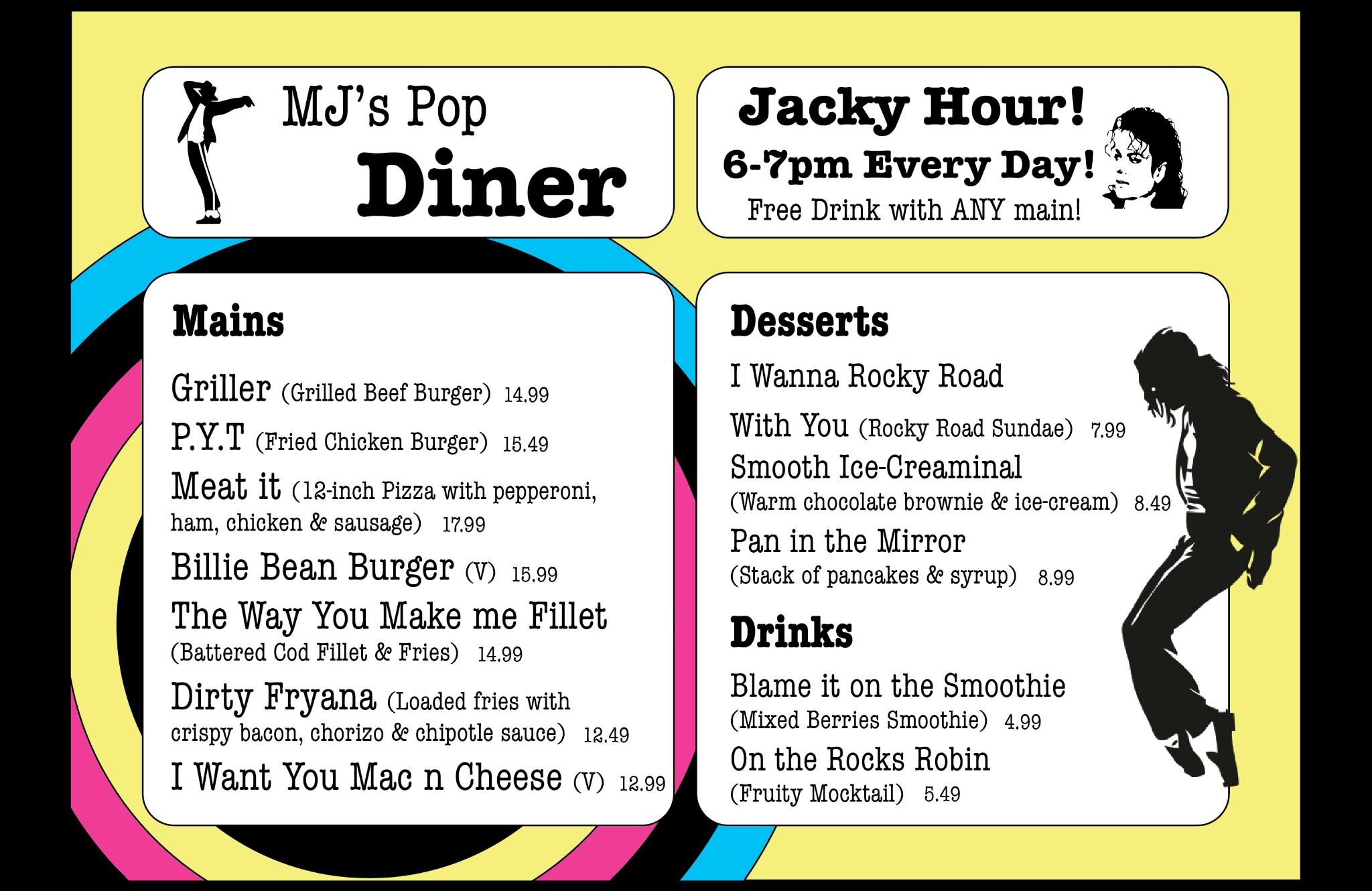
To enhance my creative thinking and explore design through a nostalgic lens, I set out to create a product that could have existed in a café during the 1980s. Using Adobe Illustrator, I designed a vibrant and visually engaging menu for a fictional Michael Jackson-themed café. I immersed myself in the visual culture of the era, incorporating bold colours, geometric patterns, and retro typography that reflected the unmistakable aesthetic of the '80s. The highlight of the project was coming up with unique and playful names for the food and drinks, each one cleverly inspired by some of Michael Jacksons biggest hits — from "Billie Bean Burgers" to "Blame it on the Smoothie". This project not only allowed me to flex my graphic design skills, but it also gave me the opportunity to fuse pop culture, humour, and historical design trends into a cohesive and imaginative concept.
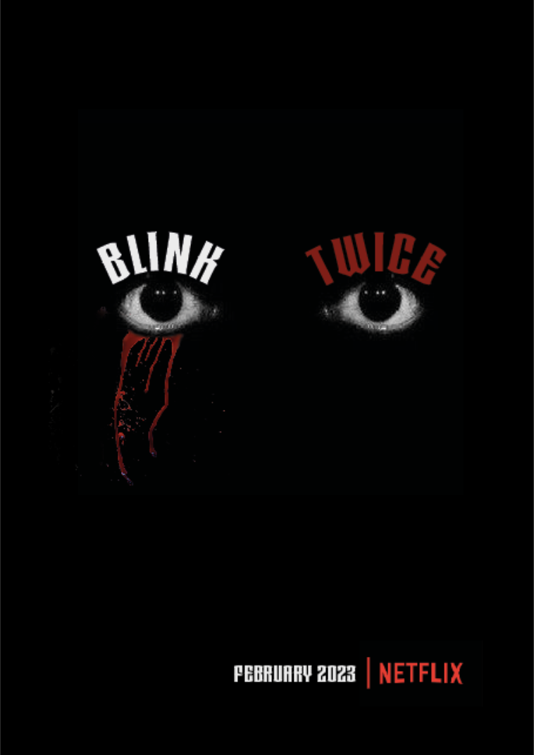
This was one of my early projects using Adobe InDesign, that challenged me to think creatively about visual storytelling. The brief required me to design a film cover for a fictional movie titled ' Blink Twice', which I interpreted as belonging to the horror/thriller genre. I chose to take a minimalist approach with the design, using negative space to create a sense of unease and focus. A solid black background — often associated with fear and the unknown — helped set a dark, ominous tone. At the centre of the attention a pair of eyes draws immediate attention, evoking a sense of being watched. To heighten the tension, I added a single red teardrop beneath one eye, symbolising violence, danger, and the emotional intensity often found in horror films. While simple in execution, the final design communicates a strong mood and narrative, proving that sometimes less is more when it comes to impactful design.